Note
Click here to download the full example code
Plotting Date Time Charts
Plotting vectors is handled by pygmt.Figure.basemap.
Note
This tutorial assumes the use of a Python notebook, such as IPython or Jupyter Notebook.
To see the figures while using a Python script instead, use
fig.show(method="external") to display the figure in the default PDF viewer.
To save the figure, use fig.savefig("figname.pdf") where "figname.pdf"
is the desired name and file extension for the saved figure.
import numpy as np
import pygmt
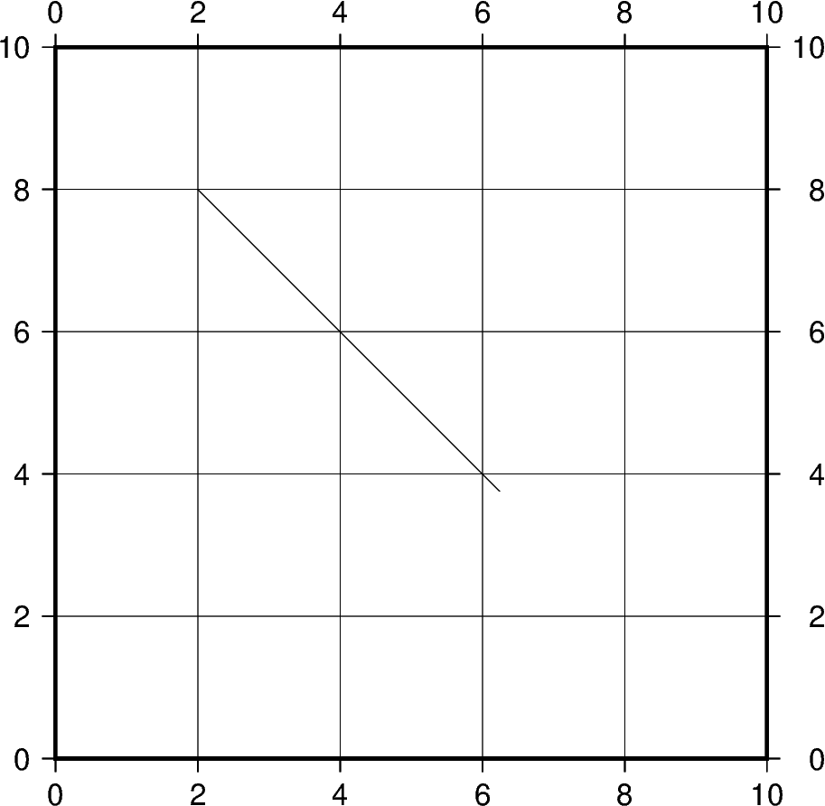
Plot Cartesian Vectors
Create a simple Cartesian vector using a starting point through
x, y, and direction parameters.
On the shown figure, the plot is projected on a 10cm X 10cm region,
which is specified by the projection parameter.
The direction is specified
by a list of two 1d arrays structured as [[angle_in_degrees], [length]].
The angle is measured in degrees and moves counter-clockwise from the
horizontal.
The length of the vector uses centimeters by default but
could be changed using pygmt.config
(Check the next examples for unit changes).
Notice that the v in the style parameter stands for
vector; it distinguishes it from regular lines and allows for
different customization. 0c is used to specify the size
of the arrow head which explains why there is no arrow on either
side of the vector.
fig = pygmt.Figure()
fig.plot(
    region=[0, 10, 0, 10],
    projection="X10c/10c",
    frame="ag",
    x=2,
    y=8,
    style="v0c",
    direction=[[-45], [6]],
)
fig.show()
Out:
<IPython.core.display.Image object>
Total running time of the script: ( 0 minutes 0.900 seconds)